The conversion work that takes someone from searching for help to a first call with NOCD: the therapist directory and profiles, the intake flow that gets them to the right call, and the fallbacks that offer another way in when they leave.
Role
UX lead for the directory, therapist profiles, and intake flow, working with growth and a UI designer
Team
Growth lead and SEO lead from marketing, a UI designer, and a web engineer
Outcome
Profiles that convert better, and a second chance for people who leave before booking
Context
NOCD provides specialized treatment, which means we can only treat people who have OCD symptoms. Sending someone into treatment who isn’t a fit wastes their time, their therapist’s time, and company resources, so identifying the right candidates early matters.
That’s why the first step is a call with an intake specialist. They work through insurance coverage, screen for OCD symptoms, and match the person with a therapist, which also depends on location, since the match only works if an eligible therapist is nearby. The scheduling questions before the call do part of this screening.
The design problem: how do you guide someone through a complex onboarding without losing them along the way?
What changed
Directory and therapist profiles
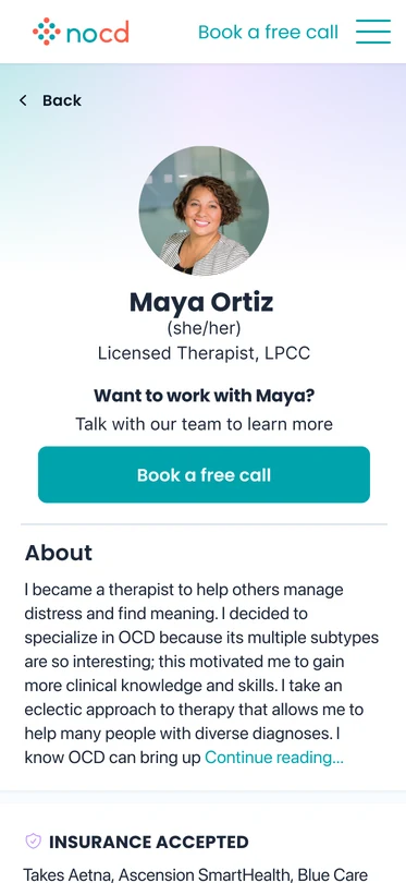
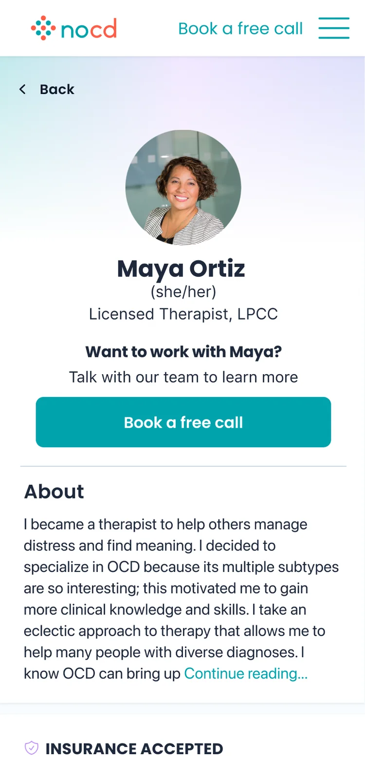
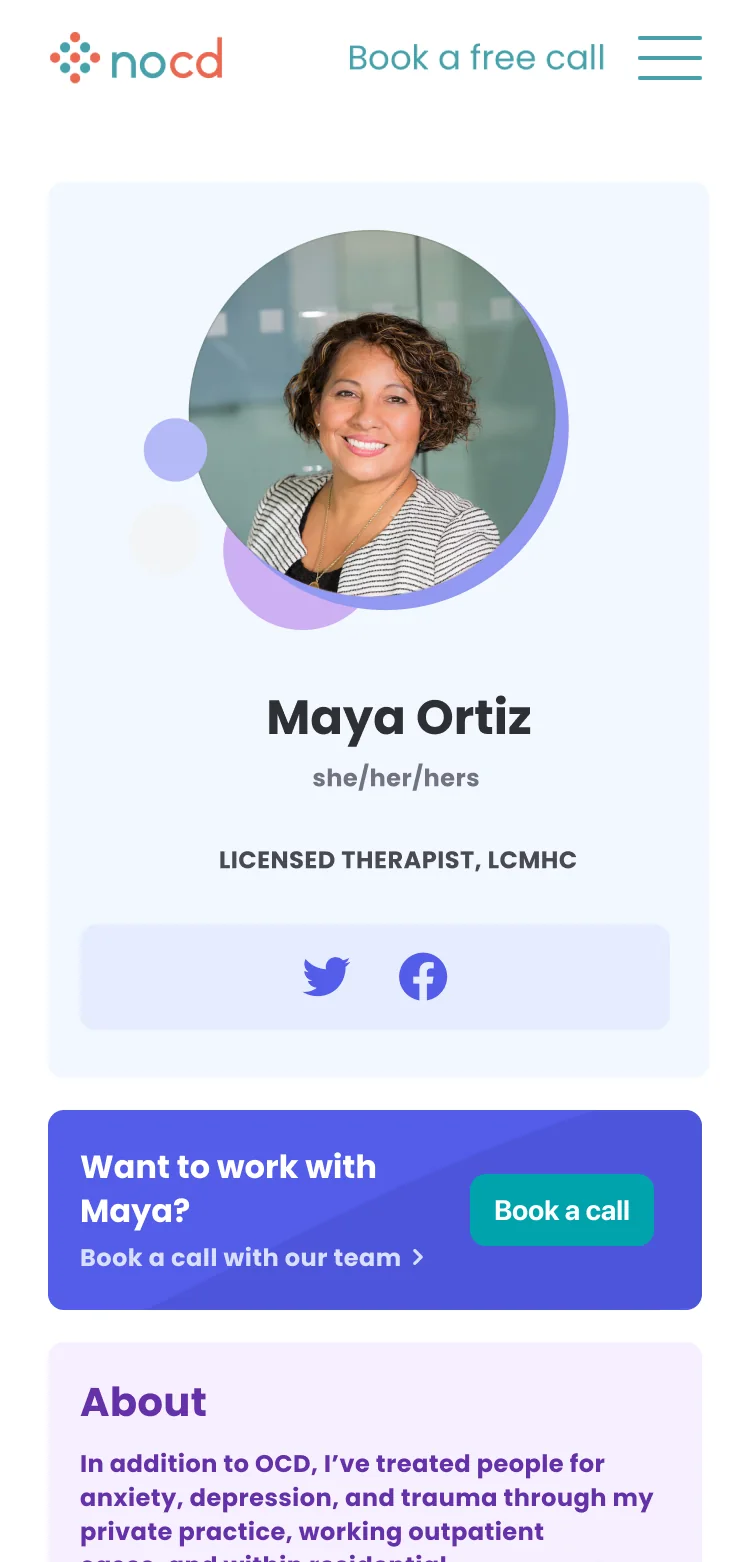
The therapist profile is where people see credentials, and it’s where trust begins. It’s also where people see the clinical standards behind the care. I worked with marketing and our growth lead, who pulled data on which pages earned the most clicks and converted best. Profiles came out on top, since that’s where the human connection is. So we designed the directory to keep people from browsing endlessly and move them toward opening a profile sooner.
The profiles belong to one cohesive design system. I built them from the member profiles, which had recently been redesigned, reusing their UX patterns and components, with a UI designer supporting the visual work.
20222024
⋮
The therapist profile, 2022 and 2024. Names are made up, and photos are stock or illustrated. Drag to compare.
2025
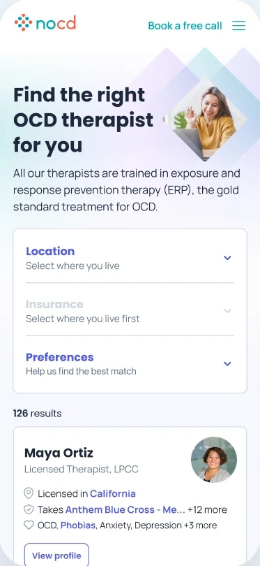
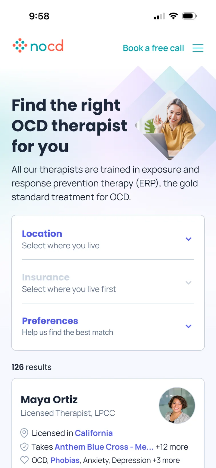
Location comes first and unlocks insurance, then preferences narrow the list. Each card leads with license, insurance, and specialties.
2024
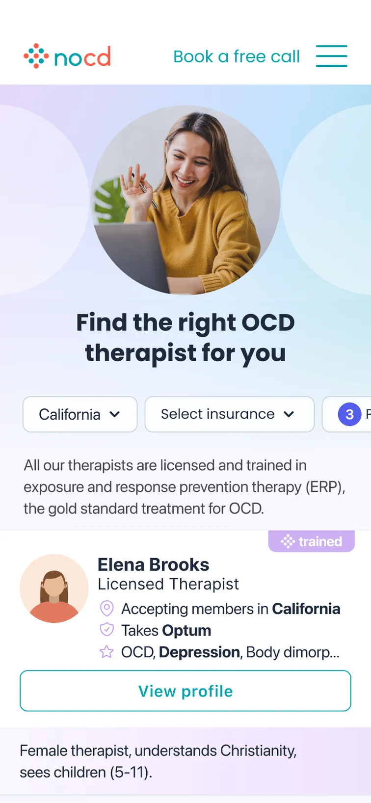
Filters for location, insurance, and preferences sit across the top, and each therapist gets a short note on who they work with.
2023
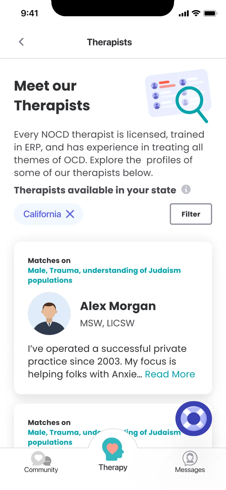
One long list, filtered by state. Each card says why the therapist matches, followed by a short bio.
The therapist directory, newest first. Names are made up, and photos are stock or illustrated.
Asking just enough
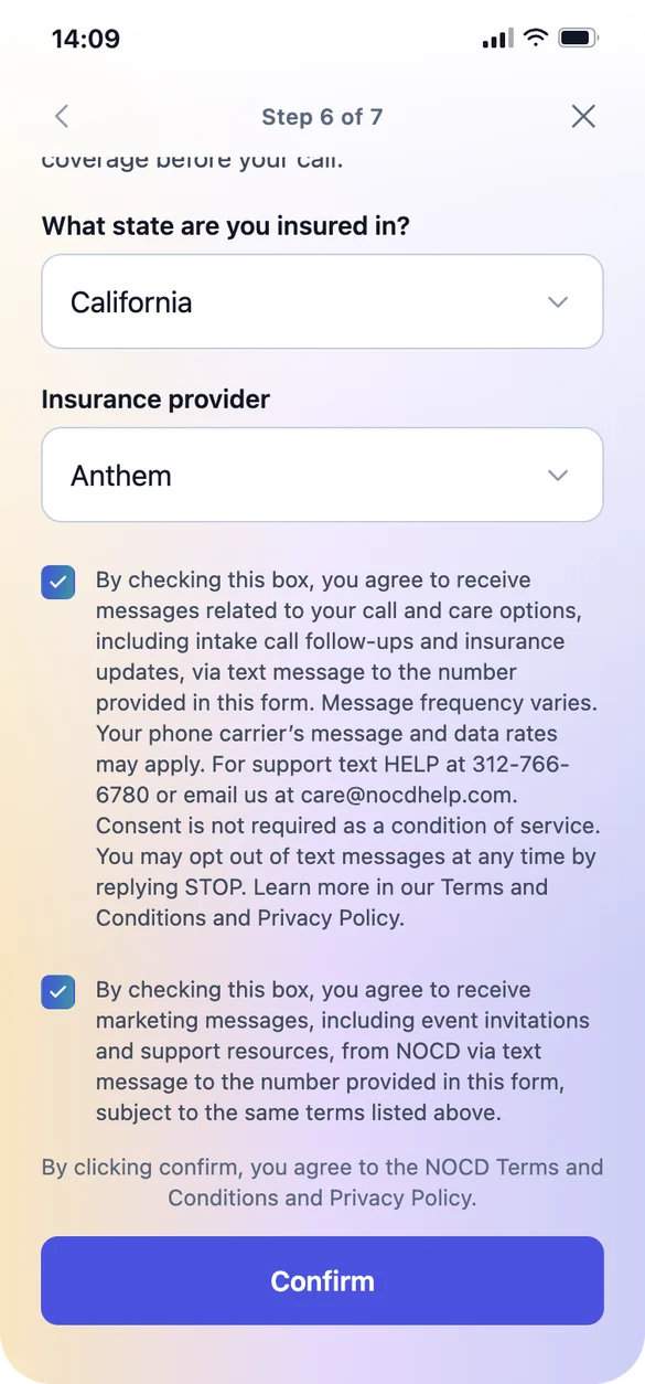
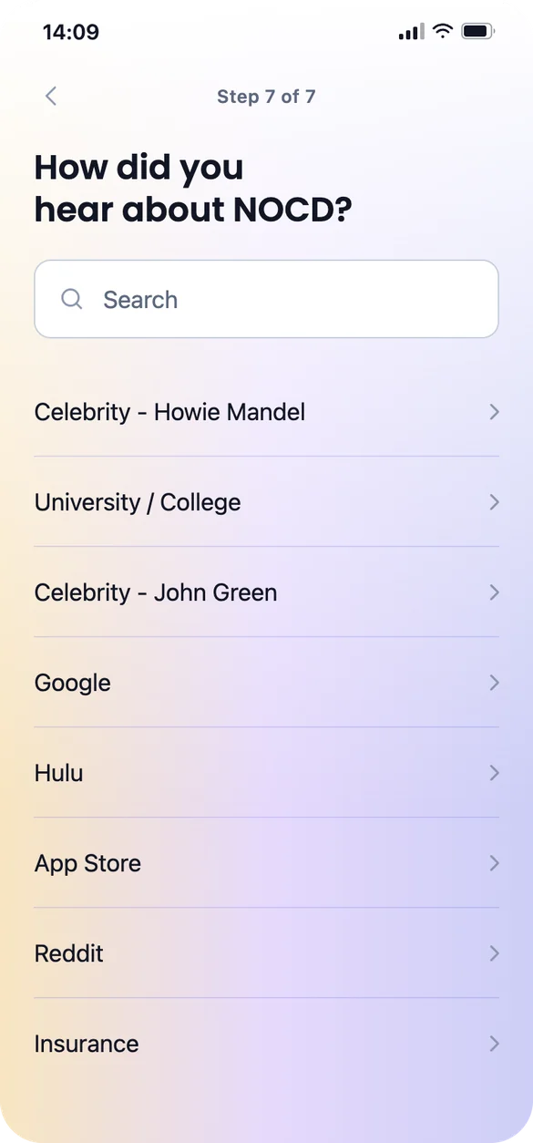
Before the first call, we need to know where someone is and how likely they are to be in network, without being able to confirm it yet. Every question we add is another reason to leave, so the flow asks only what the intake specialist needs to make that first call work. I designed the UX for the full book-a-call flow and coordinated delivery with a UI designer, who handled part of the UI before I took on more of it myself.
We also tested letting everyone book a time on their own, without the call. It did worse: more people booked who weren’t eligible, or didn’t book at all. So self-booking opens up only where testing shows it works.
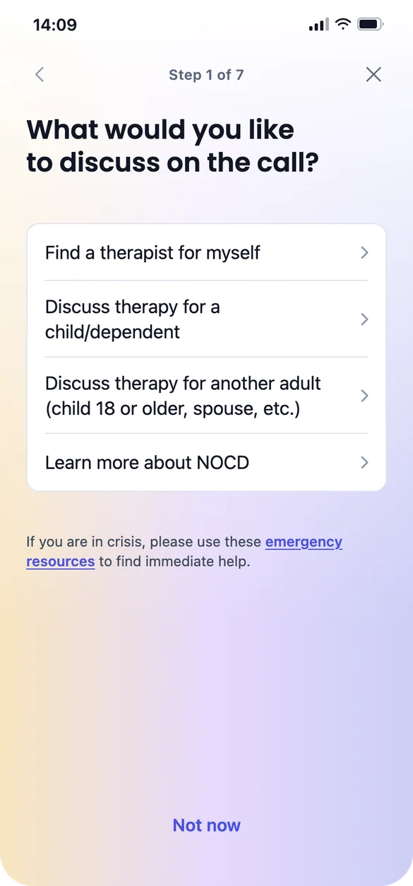
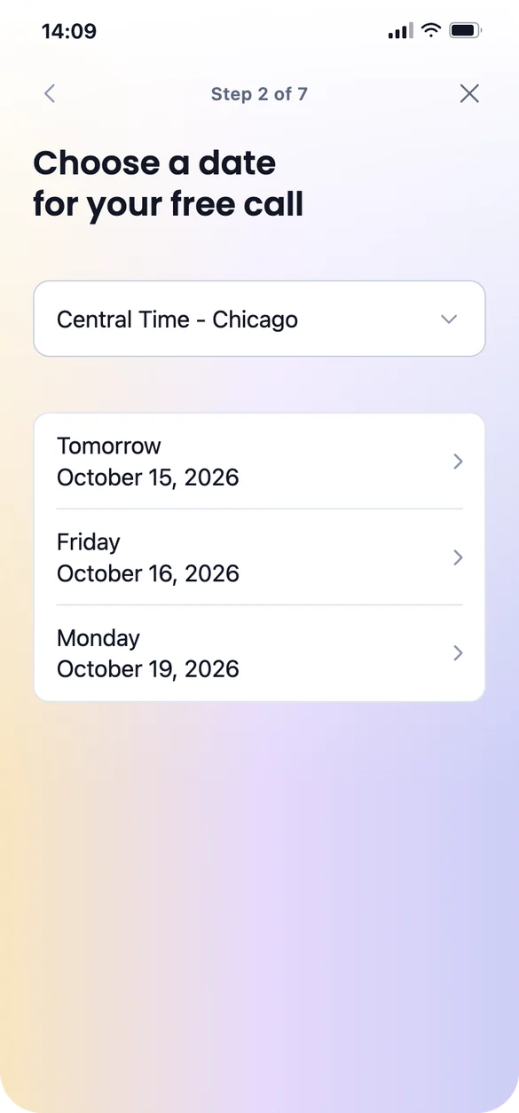
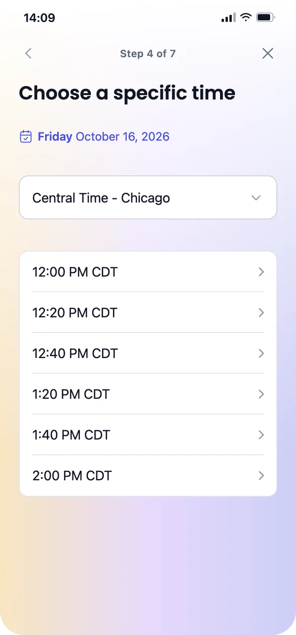
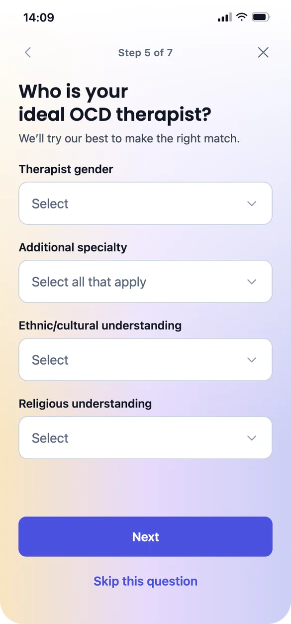
StartTalk now or later1Who the call is for2A date, in your time zone3Morning, afternoon, or evening4A specific time5Match preferences, all skippable6Contact details and insurance, checked before the call7How you heard about NOCD
A second chance
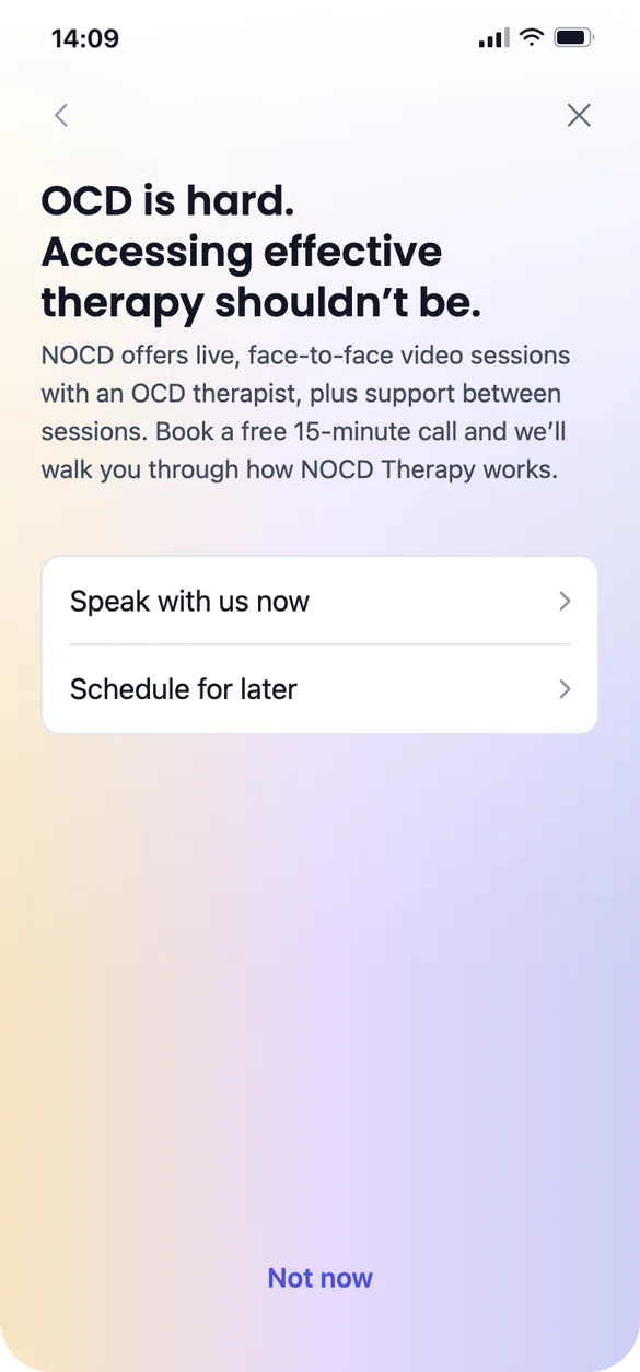
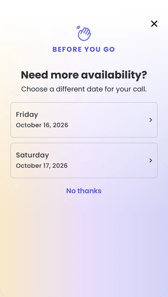
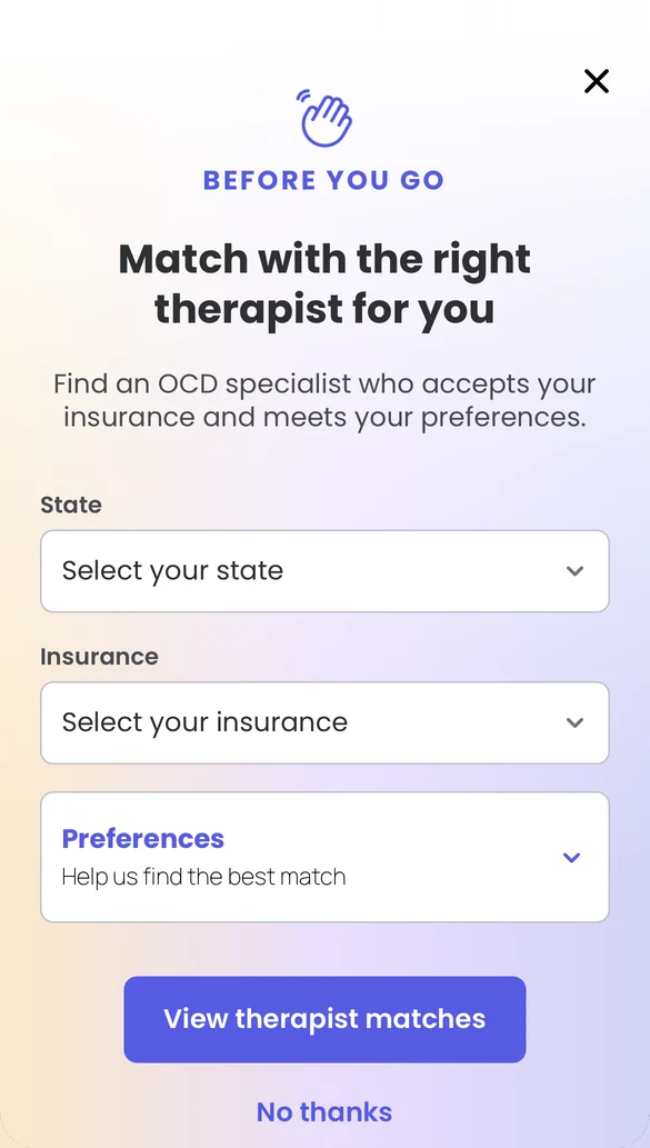
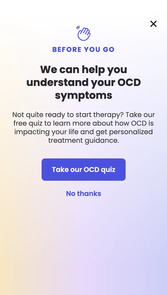
The longer the gap between someone asking for help and speaking with a person, the less likely they are to complete a session. So when someone leaves the flow, we offer a second path, and which one depends on where they leave. The fallbacks came out of my work with the growth lead, and went through A/B testing.
The fallback screens for people who leave the flow.
Outcome
Both lifts came from the profile redesign and are statistically significant, measured before and after launch. The fallbacks bring in a few more conversions a day from people who would otherwise have dropped off.
8%
more likely to click to book after viewing a therapist profile