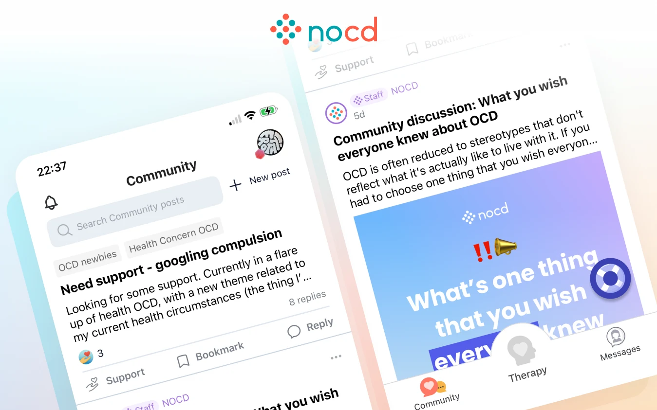
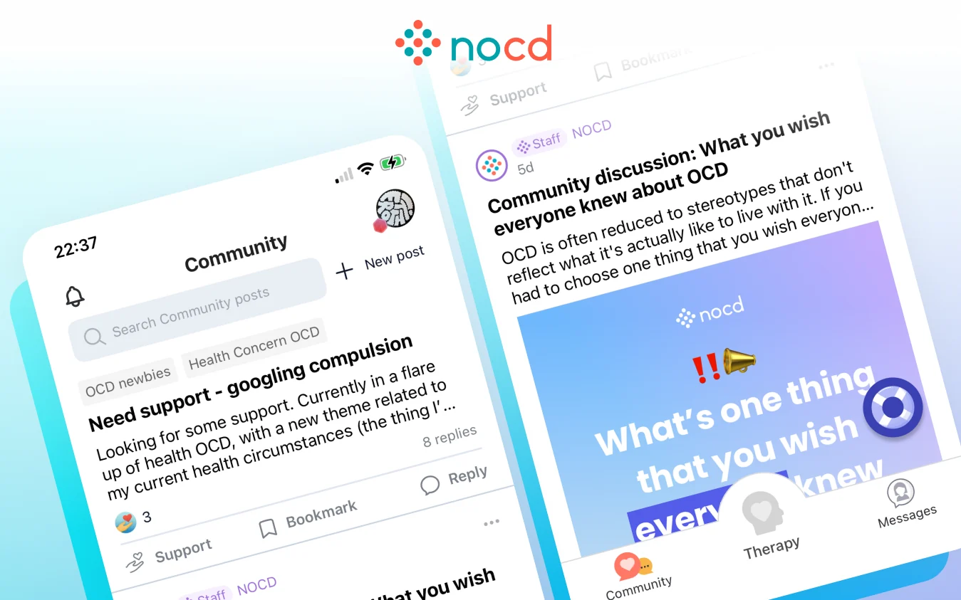
Noto is the parent company behind NOCD and Rebound. When Noto acquired Rebound, its app was a library of free educational resources for people with PTSD, with no therapy in it. The goal was to turn it into a way to connect members with care: a product with its own identity, running on the same systems as NOCD.
Role
Lead designer, coordinating design across the apps and the product design system
Team
A founder and clinical lead, as my product partner
A contract web designer
A front-end web developer
A Flutter developer and an iOS developer
Outcome
Live and onboarding therapists and members in under three months
The work
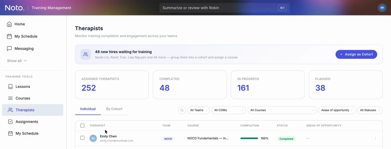
Four things shipped together: an iOS app, a Flutter app, a web app, and a redesigned marketing website. Rebound had to plug into Noto’s EHR and the back end that matches members with therapists, so I started from what the two products share, and used the clean start to make Rebound lighter and more focused from the first release.
Designing for a different condition
The two conditions need different tools. OCD treatment often asks members to enter data: logging what they feel, building and managing a hierarchy of exposures. PTSD treatment is more about processing one large experience. A member might tell their story once and re-listen to it later, so the hierarchy is simpler and there is far less tracking. As a result, many Rebound screens are voice driven.
A guided storytelling session from the self-guided journey, shortened.
Practice
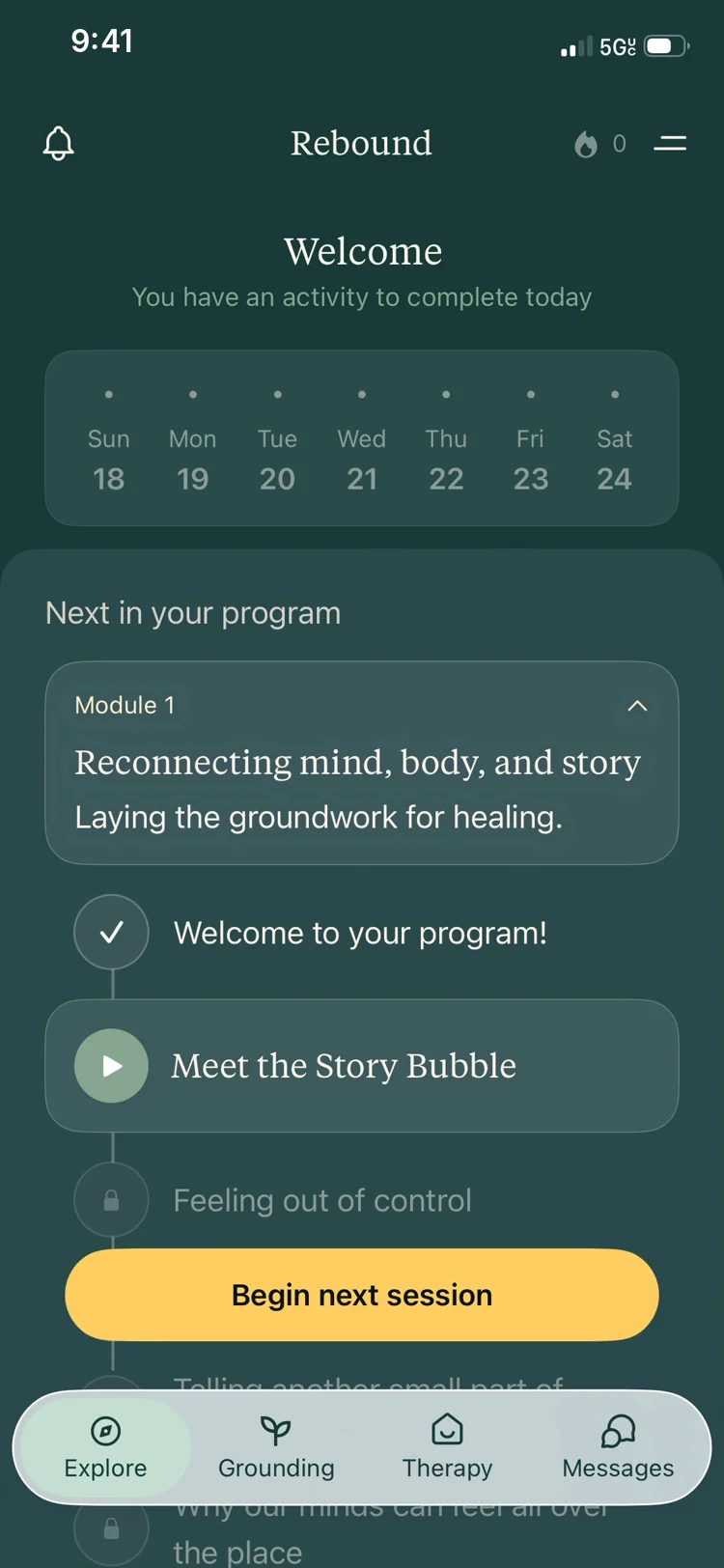
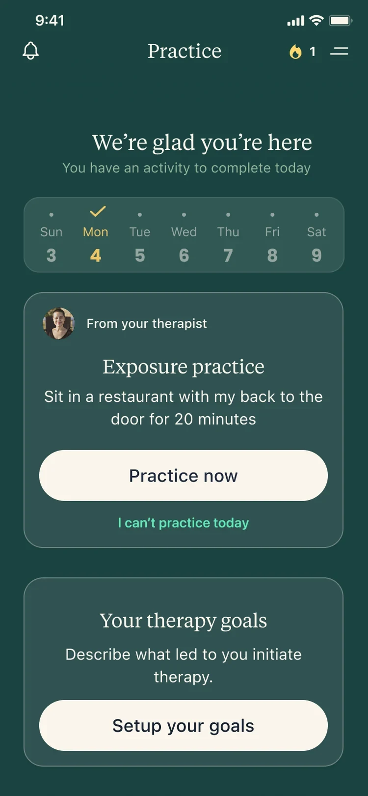
I designed the practice experience from scratch with the founders. It’s a linear path that tells members what matters right now, such as today’s homework or the activities available to them. There are two versions, one for members not yet in therapy and one for members who are, and I designed the homework features as well.
Free educational contentPersonalized therapy
Grounding
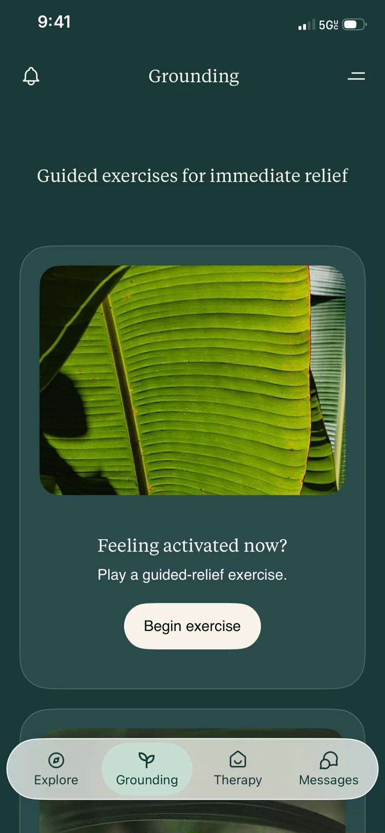
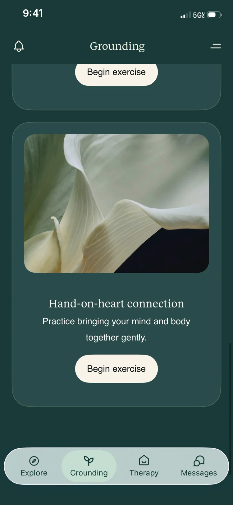
Where NOCD has episode support, Rebound has a grounding feature, built to help someone stay calm through a panic attack. I helped scope it, designed the structure that holds it, and art directed it. I collaborated with a design contractor to get it live faster and design QA’d the result.
Grounding exercises include breathing techniques.
Streaks
Rebound has streaks: a small flame that lights up when a member reaches their daily goal. NOCD stays away from streaks, because for people with OCD they can turn into compulsive behavior. That risk isn’t the same with PTSD, so Rebound could use them to encourage practice. Even here, the goal screen reminds members that healing takes both effort and rest.
Reaching the daily goal: the flame lights up and the day gets its check.
A distinct look and feel
The two brands needed to be recognizably different. NOCD is warm and gradient driven, layering sunrise and sunset colors from nature. Rebound uses nature differently, with leaf-like textures, lighter linear icons, and screens that alternate between light and dark to create a rhythm. Typography takes center stage, and guided moments built around breathing and meditation are part of the brand. That suits PTSD, where they support regulation. We deliberately avoided them in NOCD, where they can become a compulsion.
Leaf textures, serif type, and a palette that moves between deep green and cream.
NOCDRebound
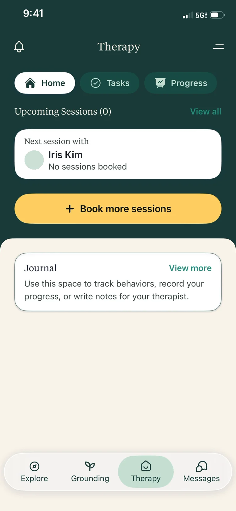
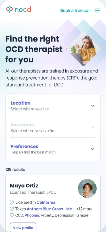
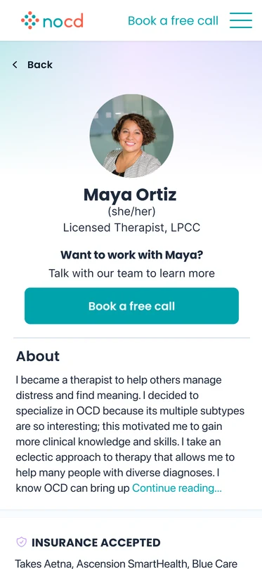
The therapy tab in each brand, built on the same structure. Names are made up.
Launching in phases
The first release focused on connecting members with therapists and onboarding therapists. We needed to learn what members actually needed and have enough of them to justify the next features. Homework followed as a second release. Design took about two weeks, and the app was live and onboarding both therapists and members in under three months. The first members were connected with therapists within a month of launch.
2 weeks
of design for the first release
Under 3 months
to live, onboarding therapists and members
Cross-pollination and synergies
The learning went both ways. Rebuilding workflows from scratch let us simplify tokens, styles, and flows on the Rebound side. We then brought some of that back to NOCD, including how clinical forms are delivered and completed.